
Here's a number that should bother you: 40-60% of users who sign up for a free trial of your SaaS product will never come back after their first session.
Not because your product is bad. Not because they found a competitor. They simply... left. Confused, overwhelmed, or unconvinced that your tool would solve their problem. And they left before they ever experienced the thing that makes your product great.
If you're a solo founder or small team, you've probably felt this. You watch the analytics. New signups roll in. But the activation rate? Brutal. The support inbox fills up with variations of "how do I do X?" And every time you think about fixing onboarding, you realize it would mean pulling an engineer off feature work for two weeks—time you don't have.
So you do nothing. Or you add a tooltip. Or you write documentation that nobody reads.
Here's the uncomfortable truth: your onboarding probably sucks not because you don't care, but because most onboarding advice is written for companies with dedicated growth teams, product managers, and six-figure experimentation budgets.
You have none of those things. Let's talk about what actually works when it's just you.
Fix your onboarding in 5 minutes.
Interactive tooltips and product tours — no engineering sprint required. Less Payment, forever.
Get Started →The Real Problem Isn't Explaining Features
Most founders approach onboarding backwards. They think, "Users don't understand my product, so I need to explain it better."
So they add welcome modals with five steps. Or build comprehensive documentation with screenshots of every screen. Or create a YouTube tutorial series that gets 200 views and zero correlation to retention.
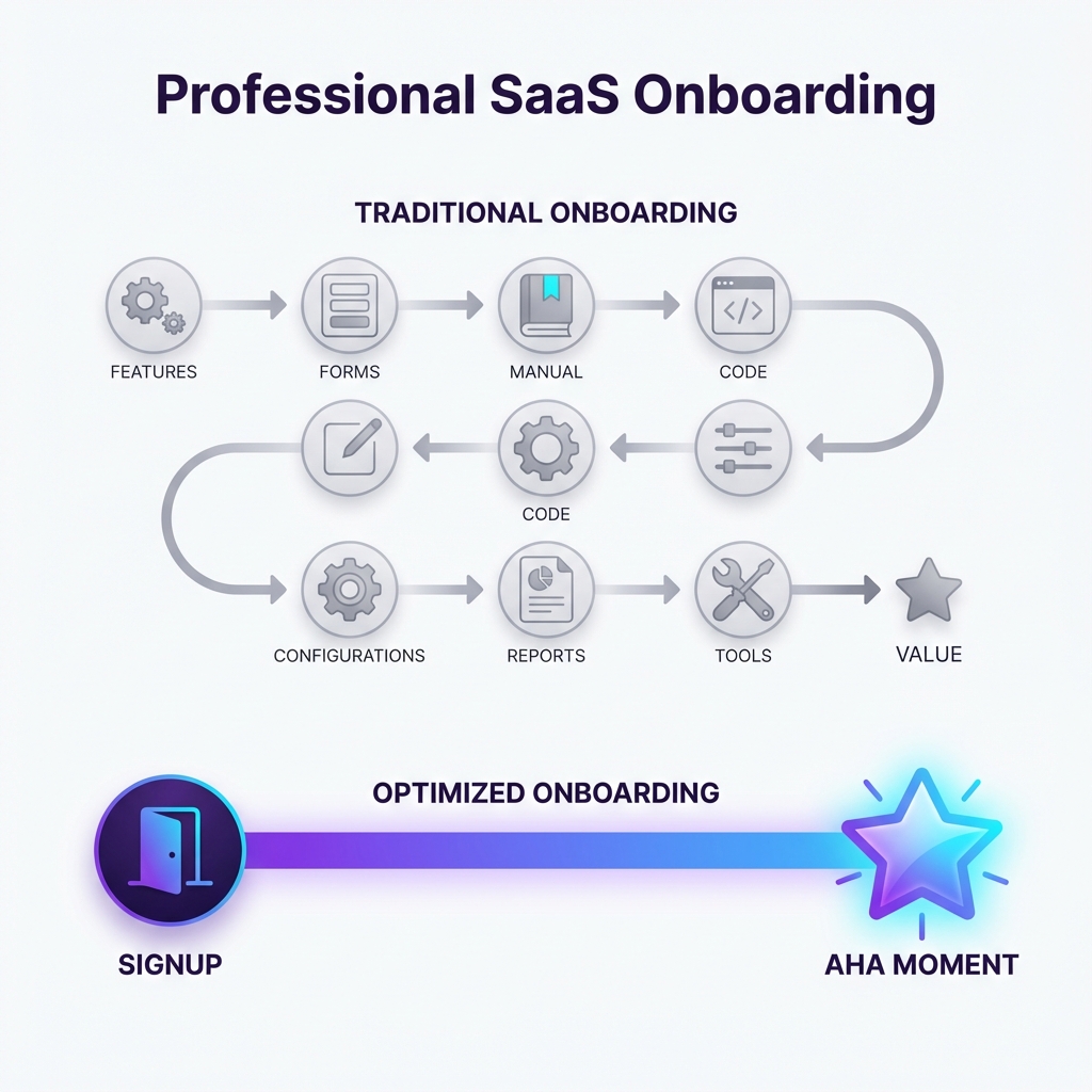
The problem isn't explanation. The problem is time to value.
Your users aren't confused about what buttons do. They're confused about whether your product will actually help them. And they're making that decision in the first 3-5 minutes based on whether they experience something valuable.
Basecamp calls this the "aha moment." Slack famously optimized for sending 2,000 messages (after which teams almost never churn). Dropbox discovered that users who saved one file in their first session were 4x more likely to keep using the product.
What's your aha moment? Not what your product does, but the specific action that makes a new user think "oh, this is going to work for me."
If you don't know, look at your most retained users. What did they do in their first session that your churned users didn't? The answer is usually simple—simpler than you'd expect. It's rarely "explored all the features." It's almost always one specific thing.
Your job in onboarding isn't to educate. It's to get users to that one specific thing as fast as possible.
Everything else is noise.
Why Common Solutions Fail for Bootstrapped Teams
Let's be honest about the tools and tactics that work for Airbnb but won't work for you.
The "Full Engineering Build" Trap
You could build a custom onboarding flow. Conditional tooltips, progress tracking, first-run experience with empty states—the whole nine yards. But this approach has three problems:
- Opportunity cost. Every week your developer spends on onboarding is a week not spent on the features that will make users stay after onboarding.
- Maintenance burden. Every time your UI changes, the onboarding breaks. Now you're maintaining two systems.
- Iteration speed. Want to test a different first step? That's another sprint, another PR review, another deploy cycle.
Unless you're past $1M ARR with dedicated engineering capacity, custom-built onboarding will always be deprioritized. And deprioritized means broken.
The "$300/Month Tool" Problem
Tools like Appcues, Pendo, or WalkMe are genuinely excellent. They let non-engineers create and modify onboarding flows without code deployments. The problem? They're priced for enterprise.
At $300-500/month, you need substantial revenue to justify the spend. And their complexity often means you'll need weeks to set them up properly anyway.
For a $40/month SaaS trying to get its first 100 customers, the math doesn't work.
The "Just Add Documentation" Myth
Documentation is important. But documentation is a pull resource—users have to want to read it. And users in their first session don't want to read. They want to do.
I've seen founders spend 20 hours writing beautiful docs that get viewed by 3% of new signups. The other 97%? They're clicking around hoping to figure it out through trial and error.
Documentation helps users who already believe in your product. It doesn't help users who are still deciding whether to invest the time.
Three Tactical Fixes You Can Implement This Week
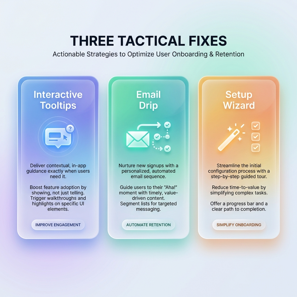
Here's what actually moves the needle for bootstrapped products—tactical changes that don't require engineering sprints, expensive tools, or organizational buy-in.
1. Interactive Tooltips for First-Time Actions
Instead of explaining everything upfront, wait until the user attempts their first meaningful action—and help them at that exact moment.
The psychology here matters. A tooltip that appears when someone clicks "Create New Project" feels helpful. A five-step tutorial modal that appears on login feels annoying.
The implementation:
- Identify the 2-3 actions that define a successful first session
- Add a single contextual tooltip for each, triggered by the user's intent (hover, click, or page navigation)
- Make the tooltip dismissible and don't show it again
This approach respects your user's intelligence while ensuring they don't get stuck. It's guided discovery, not a lecture.
Most lightweight product tour tools can do this with a code snippet and a visual editor. You're not building custom UI—you're layering helpful context on top of your existing product.
2. Email Drip with Specific Next Steps
Your welcome email probably says "Thanks for signing up! Here's everything you can do with our product."
Delete it. Replace it with this:
Email 1 (immediate): "Here's the one thing to do right now." Link to a specific action, not your dashboard. If you're a project management tool: "Create your first task in 2 minutes." If you're an analytics tool: "Connect your first data source here."
Email 2 (day 2): If they didn't complete the action: "Need help with [specific thing]? Reply to this email." If they did: "Here's what to try next."
Email 3 (day 4): Share a concrete example of a customer result: "Jane from [company type] did X and saw Y result. Here's how she set it up."
The key is specificity. Each email should include one action and one link. Not three features and a product overview. The goal is forward momentum, not comprehensiveness.
You don't need a fancy marketing automation platform for this. Most transactional email services (Postmark, Resend, even Mailchimp's free tier) can handle a simple sequence.
3. A One-Time Setup Wizard
This is the highest-effort option—but it might be the most impactful.
A setup wizard is a guided flow that runs once, when the user first logs in, and ensures they complete the foundational configuration your product needs to be useful.
The key constraints:
- 3-5 steps maximum. Every additional step costs you 20% of users.
- Each step should feel like progress. "Step 1: Enter company name" is a waste. "Step 1: Connect your calendar so we can show your availability" creates value.
- Let users skip. Some users know what they're doing. Don't trap them.
Done well, a setup wizard guarantees that when users land on your dashboard, they see something meaningful instead of empty states. It frontloads the configuration work that would otherwise cause friction throughout the first week.
When Product Tours Make Sense (And When They Don't)
Let me be direct: product tours aren't always the answer.
Product tours work well when:
- Your UI is non-obvious (dashboards with many features, complex configuration)
- There's a critical first action that users often miss
- You're seeing support tickets that a 30-second tooltip sequence would prevent
- Users who complete the tour show measurably better retention
Product tours don't work well when:
- Your product is simple enough that a clean UI solves the problem
- You're using them to paper over confusing information architecture
- The "tour" is really just marketing copy disguised as help
- You haven't identified your aha moment yet (fix that first)
If you're considering a product tour tool, try this test: describe the exact 3-5 steps your tour would include. If you can't articulate them clearly, you probably need to simplify your product first, not add more guidance on top of it.
The Approach That Scales
If there's one thing to take away: optimize for time to value, not comprehensiveness.
Generic onboarding advice tells you to explain your features. Experienced founders know the opposite: explain as little as possible. Get users to the aha moment fast. Remove every obstacle between signup and that first moment of value.
This means saying no to the five-step welcome tour. Saying no to the comprehensive feature overview. Saying no to the "everything you need to know" email.
And saying yes to one tooltip at the right moment. One email with one link. One setup wizard that actually configures something useful.
Small teams can't out-resource big companies. But you can out-focus them. You can ship a simple onboarding experience in a day while they're still in the planning meeting.
By the way, if you're looking for a tool to implement interactive tooltips without the enterprise price tag—we built Escourtly specifically for indie hackers and bootstrapped teams. It's $99 lifetime, installs in 5 minutes, and lets you create product tours without touching your codebase. Worth a look if the approach above resonates.
Interactive tooltips without the enterprise price tag.
$99 lifetime. Installs in 5 minutes. No MAU billing, no monthly fees, no complexity you don't need.
Get Started →But whether you use a tool or build it yourself, the principle stays the same: less explanation, more activation. Your users will thank you by sticking around.